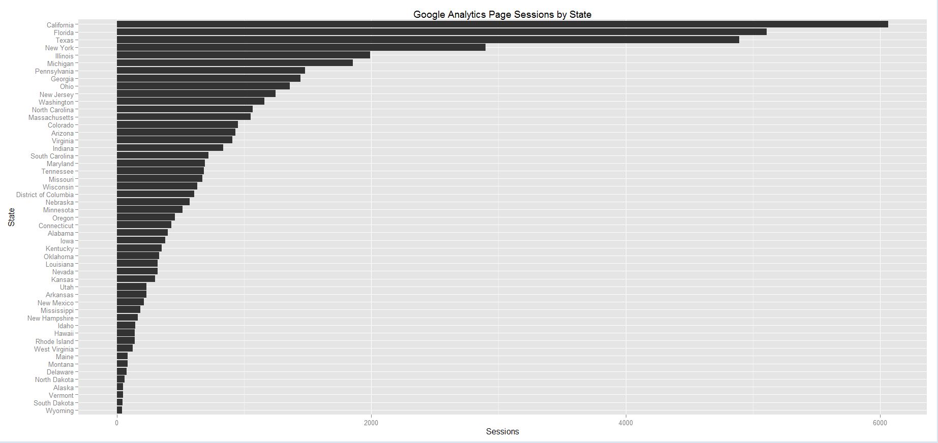
So I decided to analyze some website statistics from Google Analytics. The website data is from one of my websites https://www.asapvino.com. I wanted to use some data that was relevant to what I do for a living so that I can apply the malformation I learn from this project. So I used the number of sessions from our website for the past 6 months (which was over 100,00 sessions) and sorted that by state so I can see which states are getting the most views. This could benefit our company because we can make empirical decisions about our business and website based on this data. For example we see that California is our top state, which that data in mind we can make lsit some of our top California wines.
So I did this with the following code:
library(ggplot2)
States <- read.csv(“C:/School/states.csv”)
orderedStates=States[order(States$Sessions),]
orderedStates$State=factor(orderedStates$State,levels=orderedStates$State)
ggplot(orderedStates,aes(x=factor(State),y=Sessions)) + geom_bar(stat=’identity’) + coord_flip() + labs(y=’Sessions’,x=’State’) +
ggtitle(“Google Analytics Page Sessions by State”)
theme(axis.text.x = element_text(angle = 90, hjust = 1))
Click here for the data sheet.
Here is the visualization below (Click to enlarge):