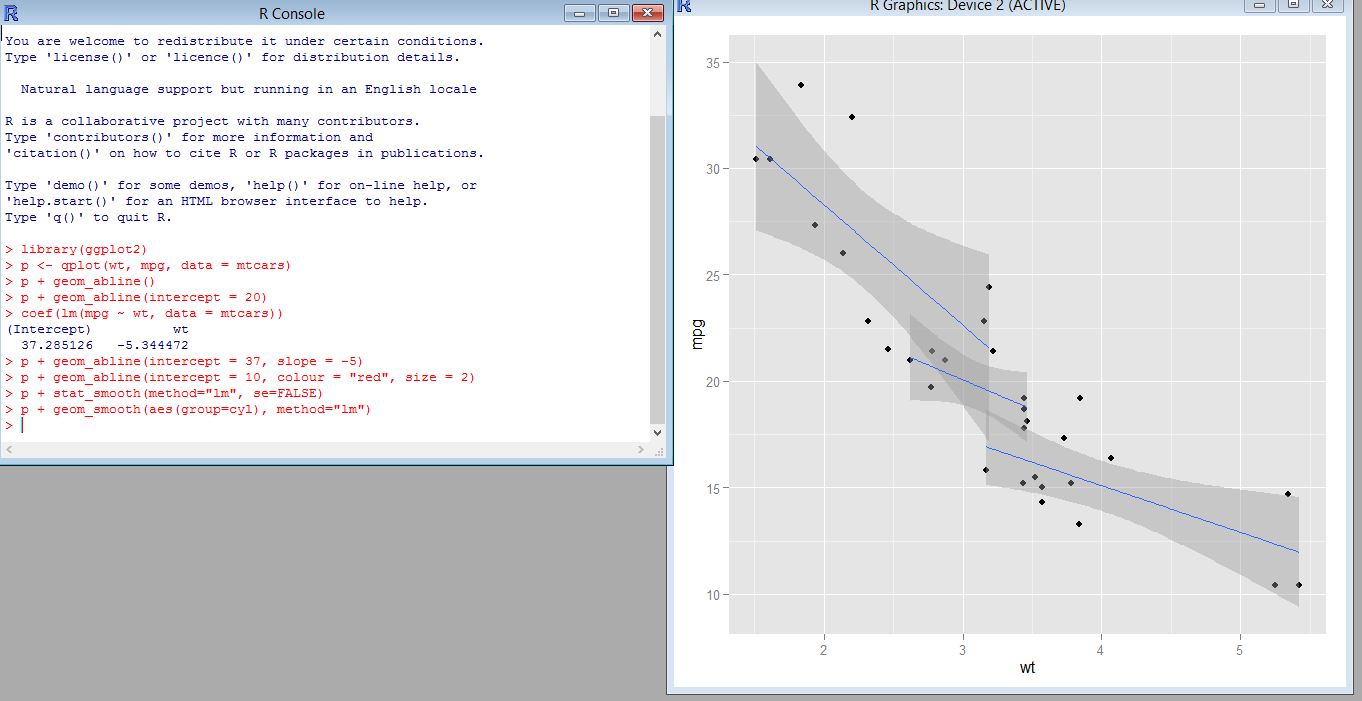
Here is the ggplot visualization i created. i created a geom_abline and did a couple of visualizations and calculations. However i found this visualization portrayed the data the best.
Here is the ggplot visualization i created. i created a geom_abline and did a couple of visualizations and calculations. However i found this visualization portrayed the data the best.