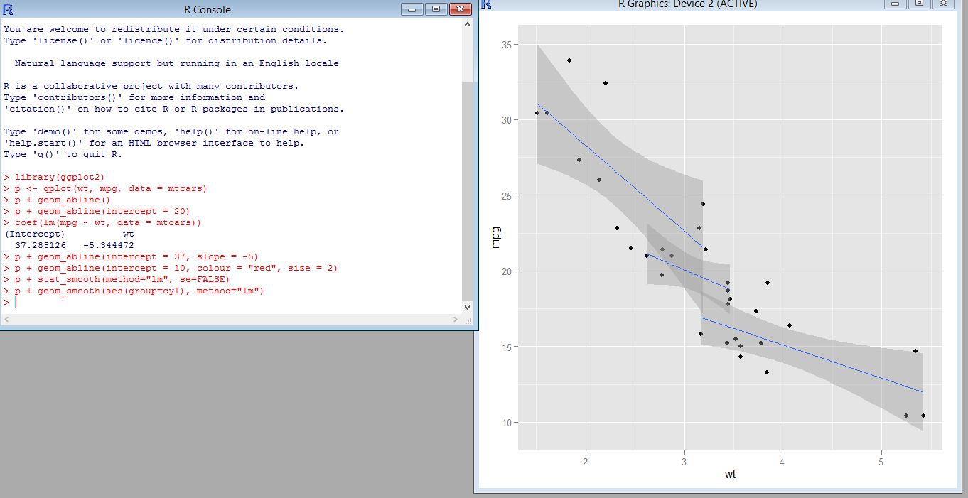
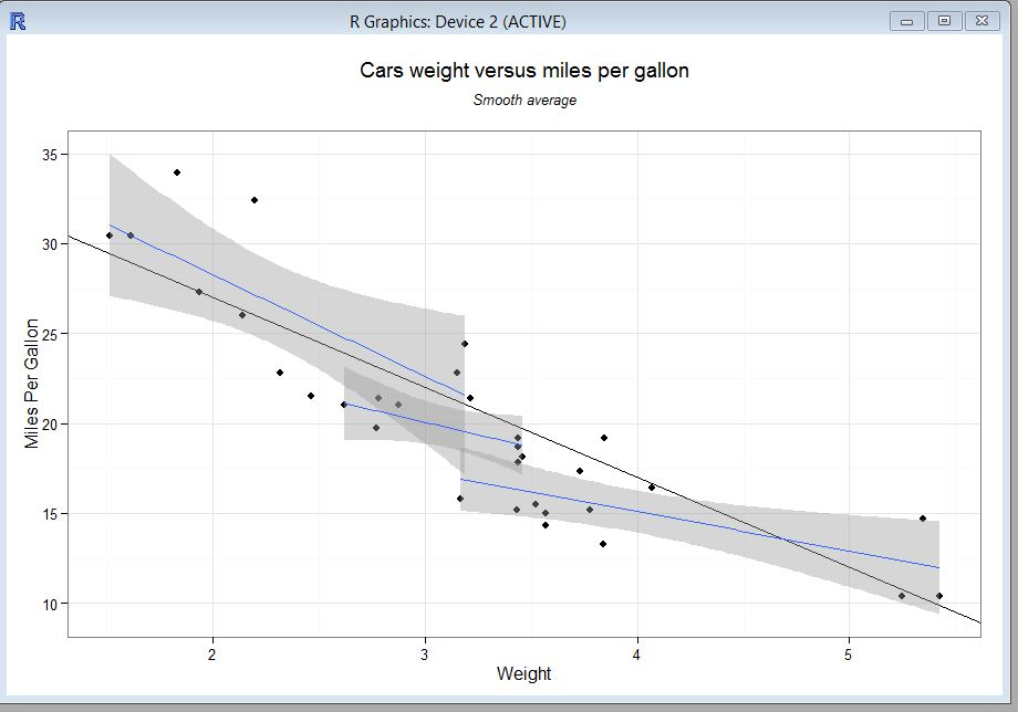
Below on the left is the old version of the visualization from module 10 and on the right is the new revised one.
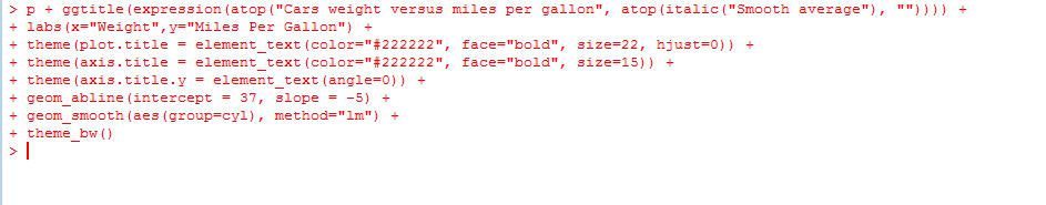
Here is the revised code:
I think that Evergreen and Emery’s strategy is a good template for creating a data visualization but is not set of strict rules. Some of the guidelines do not apply to all visualizations. For example for some visualizations there may need to be a stronger grid-lines or borders depending on how the data is being displayed.