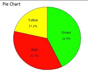
Descriptive
I categorized this image as descriptive because of the arithmetic and math such as the average to compute the percentages of each color. This image also follows the steps of descriptive statistics. I has the data collected of the percentage of each color. It has the data presented in a pie chart. Also it has the data characterized with the color and color label.
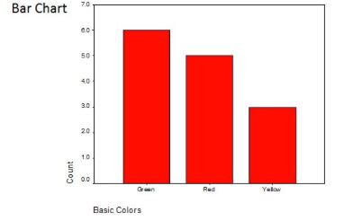
Descriptive
I also categorized this image as descriptive because of the arithmetic to get the count of each color. This image also follows the steps of descriptive statistics. It has the data collected of the count of each color. It has the data presented in a bar chart. Also it has the data characterized with the color label.
Descriptive
I thought this was descriptive just because of the fact that the data displayed was in a bar chart and there was no projection or predictions to made. the data is very “static”. However i did not fully understand the purpose of this image.
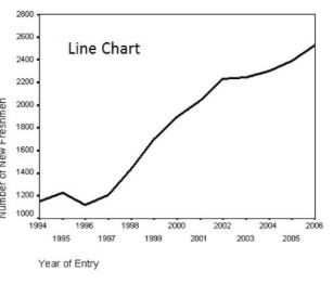
Descriptive
I also categorized this image as descriptive because it is a description in the number of freshman according to their year of entry and shows the change over time.. This image also follows the steps of descriptive statistics. It has the data collected for the number of each of the students. It has the data presented on a line chart. Also it has the data characterized by the year of entry year and the number of freshman.
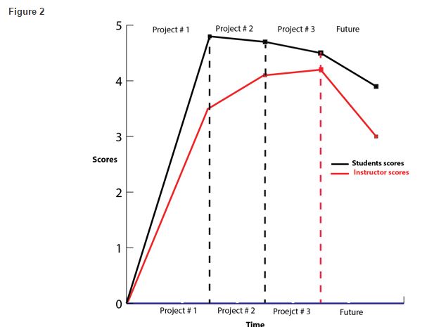
Predictive
I categorized this as predictive because of the simple fact that it has a “future” column that is for the forecast decrease in the student and instructor scores. This could also be used as a tool to make decisions on the expected scores.
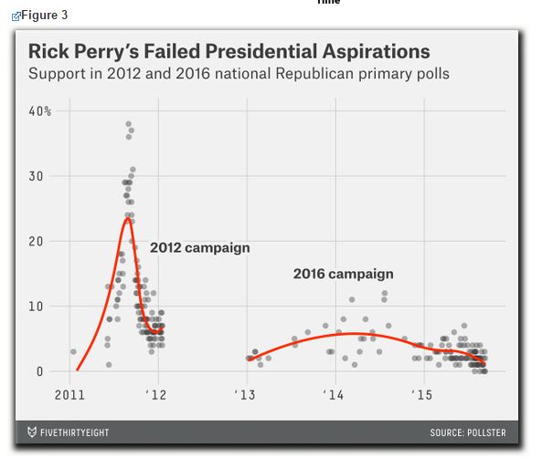
Inferential
I categorized this as inferential because of three factors. One, the is the sign of a random sample provided by the scatter plot. Two there is the hypothesis defined in the titled as the “failed” aspirations. Third there is a line of best fit for the scatters which shows the purpose is to measure the hypothesis and “infer” the validity from the data.
Recent Comments