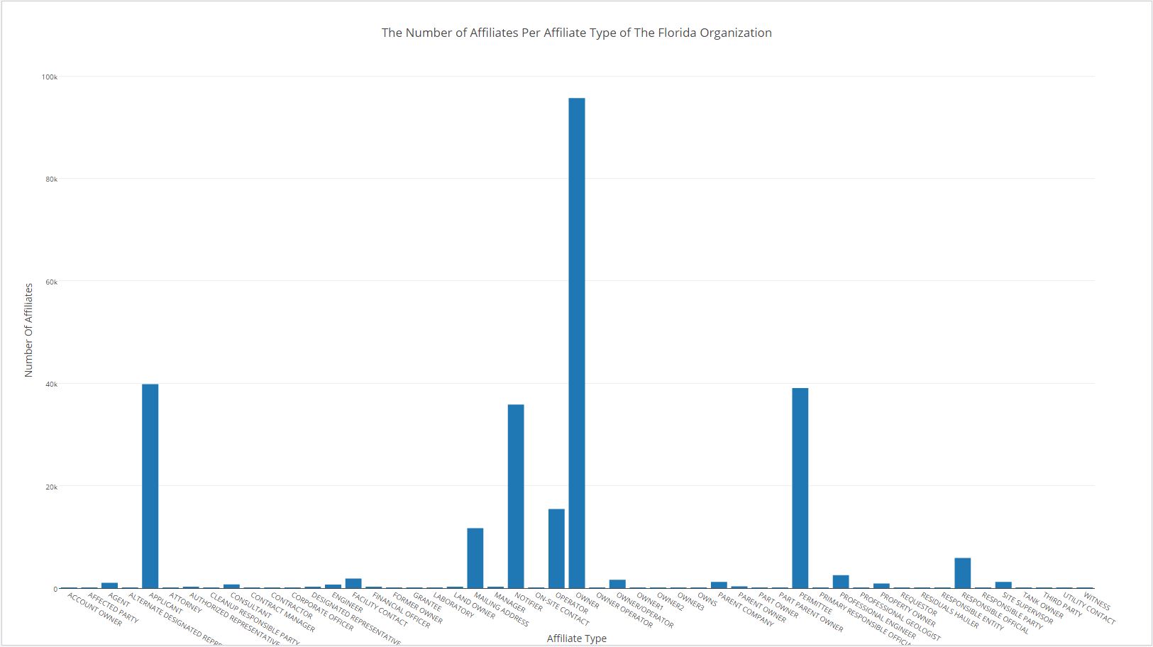
I chose to create an inferential statistics visualization. I picked to create a visualization of the column of the data that tracked the affiliate type. I did this so the examiners of the data can make decision based on trends they see in the affiliate types. So what I did is I totaled the amount of affiliates per type. I plotted the data via Plotly in a bar chart. I chose a bar chart because it exemplifies the certain affiliate types that have a high count. Here is the data is used affiliation-type.
Click to enlarge image